GRC Data Protection Assurance Platform
Redesigned an enterprise data protection onboarding experience by consolidating fragmented workflows, improving assessment visibility, and creating a clearer process for users navigating governance and compliance requirements.
Enterprise UX, Service Blueprint, IA

View detailed UX case study here
Overview
The Governance, Risk, Audit, and Compliance (GRC) platform supports employees navigating data protection assessments and onboarding activities across multiple internal systems. Existing workflows involved fragmented entry points, unclear process visibility, and limited guidance, creating friction throughout the experience.
This project focused on simplifying navigation and improving understanding of the assessment journey while maintaining enterprise compliance requirements.
Problem
Users experienced several challenges during onboarding and assessment workflows:
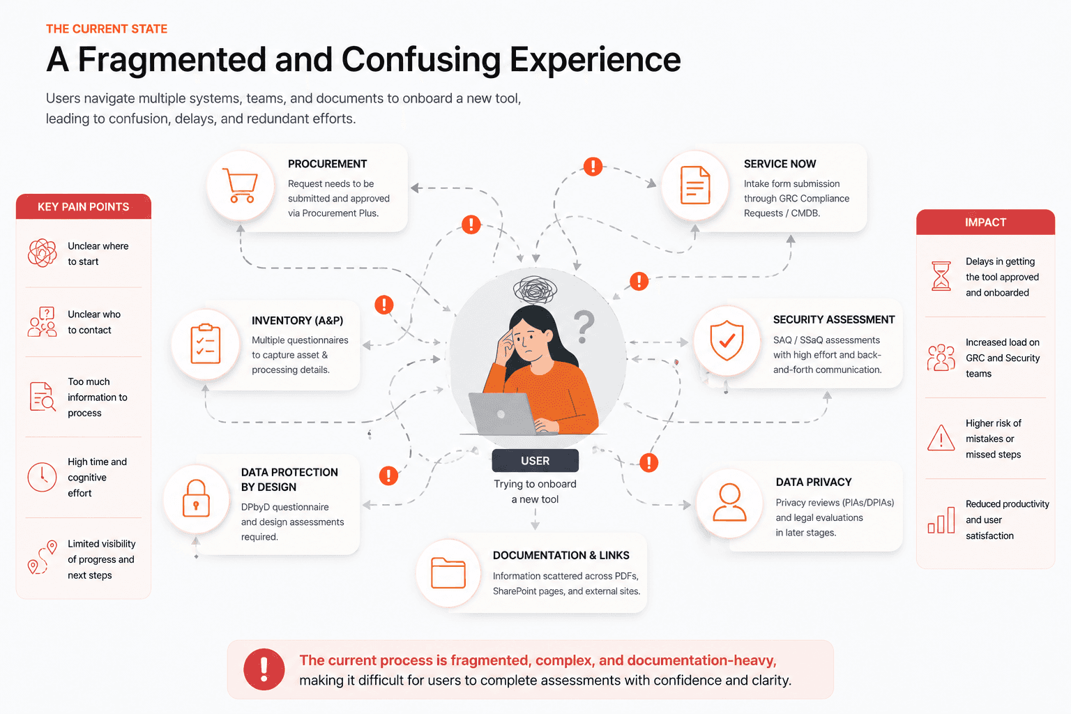
Multiple disconnected tools created context switching
Limited visibility into assessment progress
Unclear ownership and next steps
High cognitive load from dense information structures
Difficulty locating support resources and documentation
These issues increased confusion and slowed completion of assessment activities.
Objectives
The redesign aimed to:
Simplify onboarding and assessment flows
Improve process visibility
Reduce friction across workflow stages
Surface relevant support information
Create a scalable structure for future assessments
Discovery
Initial review of workflows and system structures identified patterns around navigation complexity and information overload.
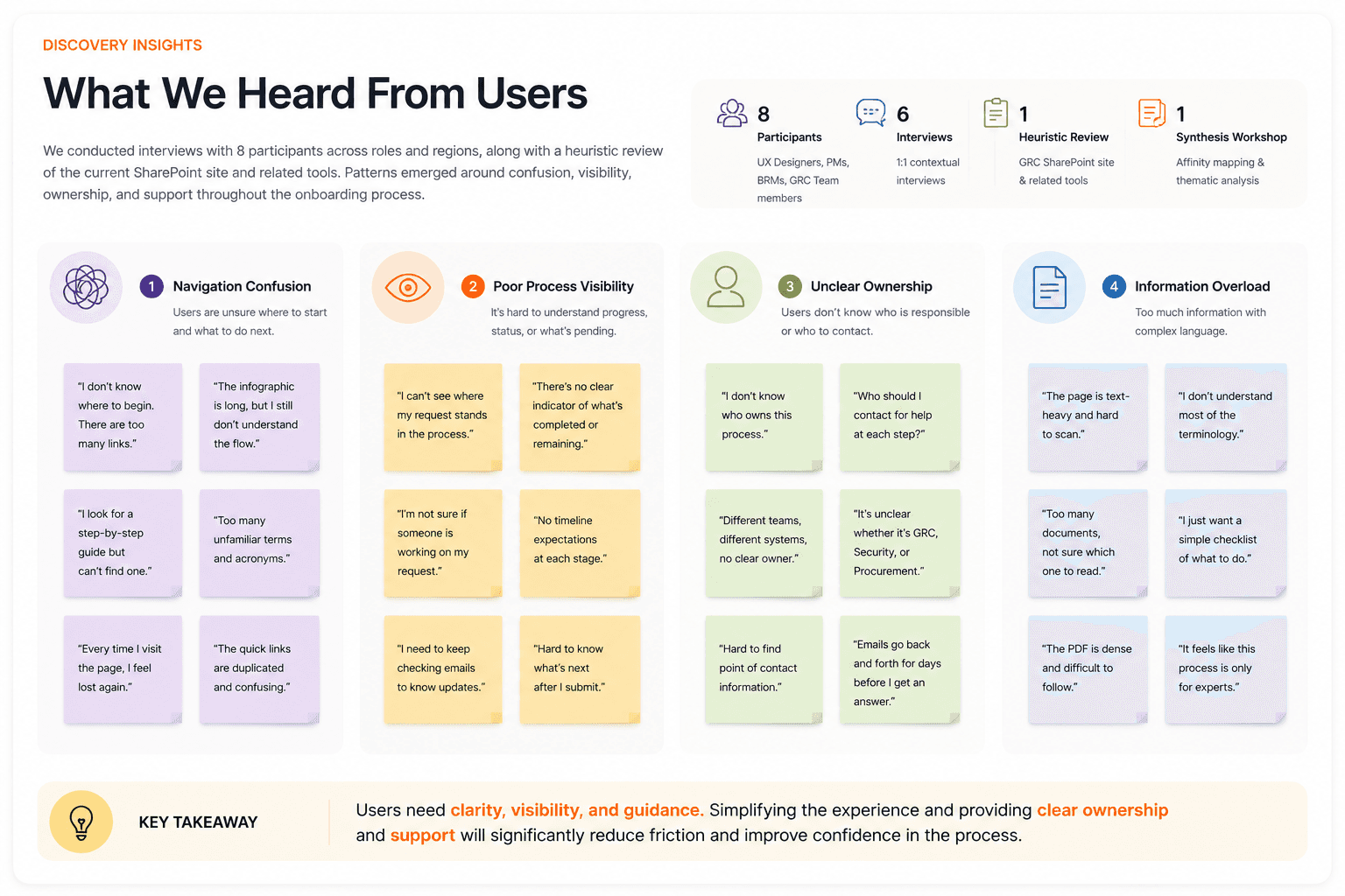
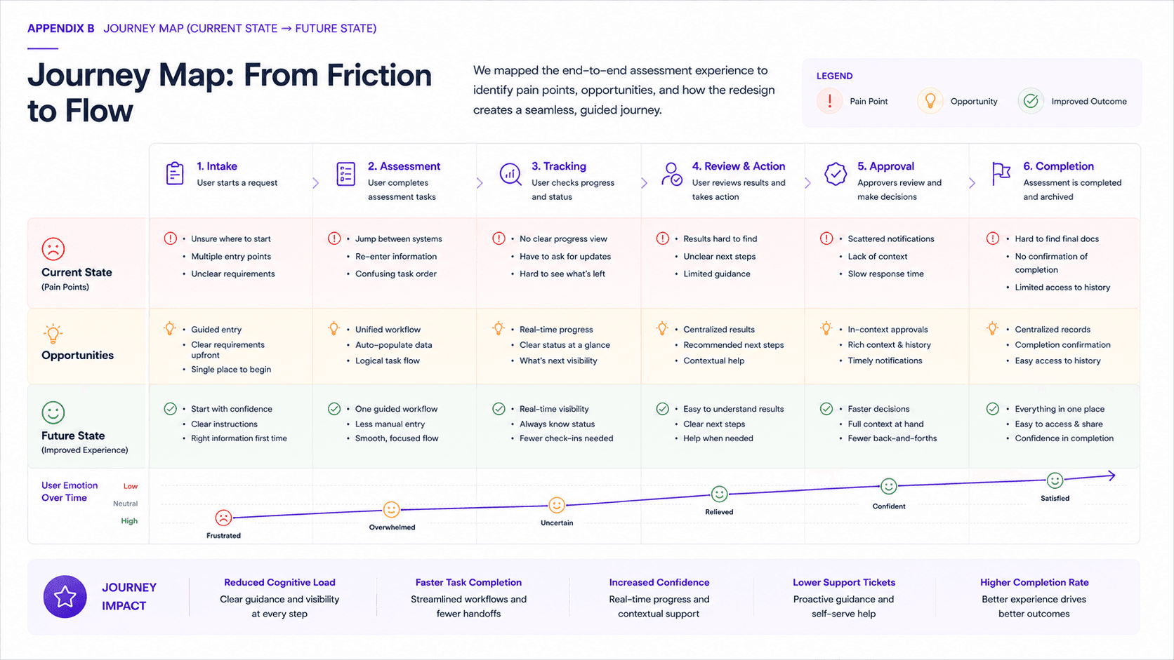
Key observations included:
Fragmented experiences
Users moved between multiple systems and entry points to complete related tasks.
Limited status awareness
Assessment progress and current stage information were difficult to understand.
Information hierarchy issues
Critical information competed with secondary content.
Design Approach
The experience was restructured around a clearer workflow model.
Key improvements included:
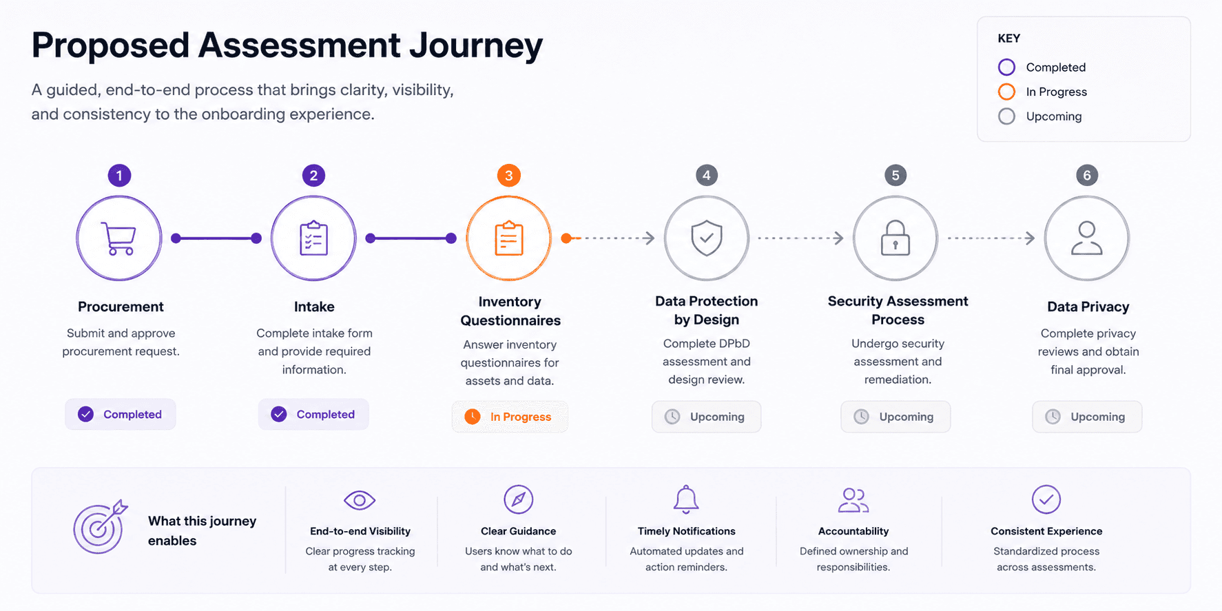
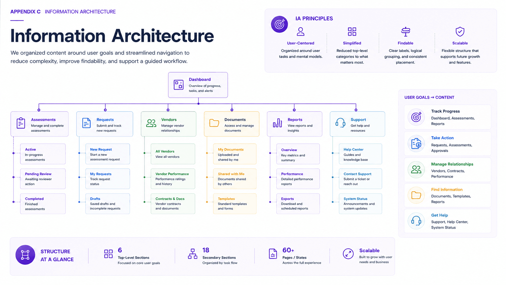
Guided process flow
Assessment stages were presented as a sequential journey rather than disconnected actions.
Dashboard visibility
Users could quickly understand:
current progress
completed activities
pending tasks
documentation status
Contextual support
Relevant help content and frequently asked questions were surfaced closer to points of action.
Wireframes
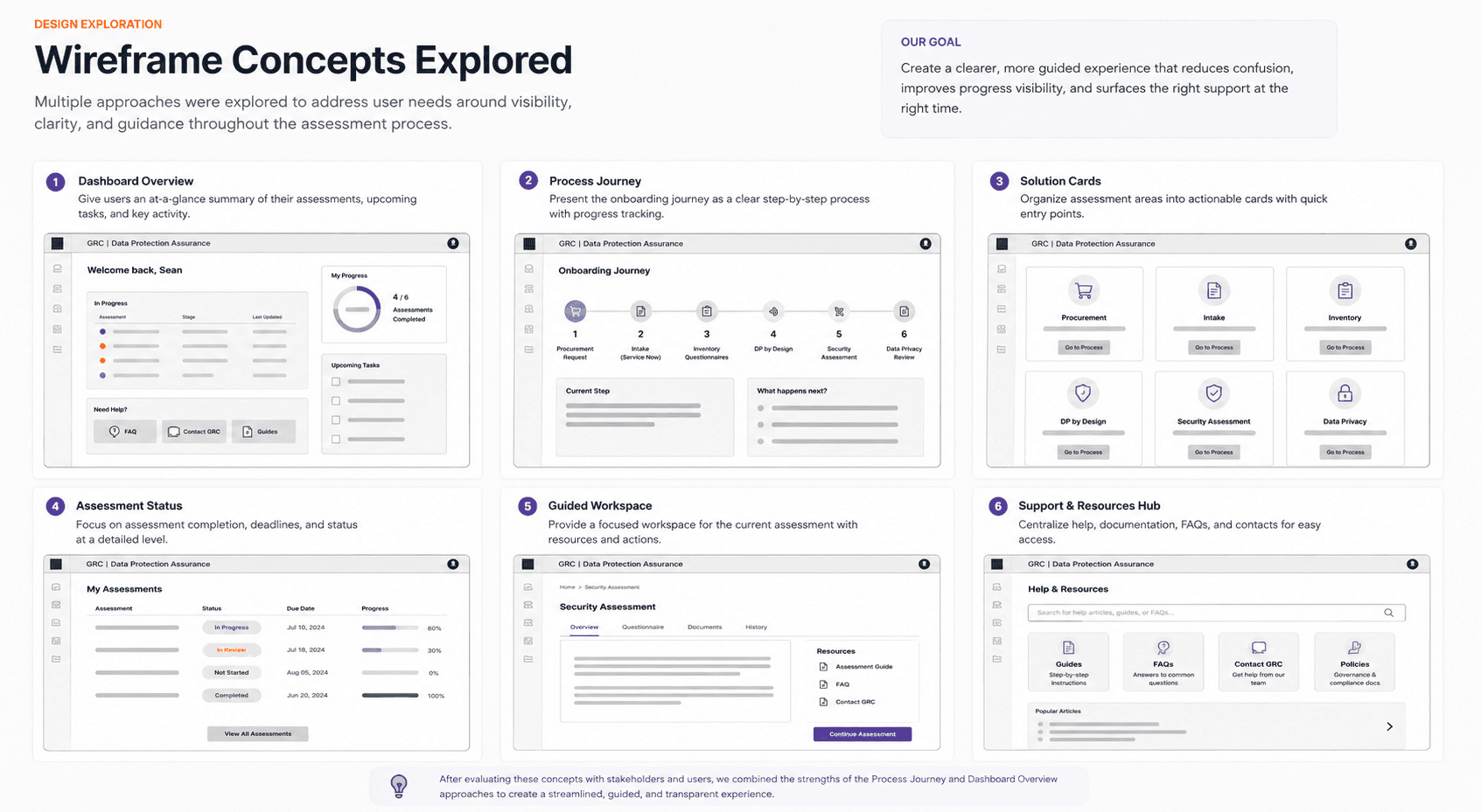
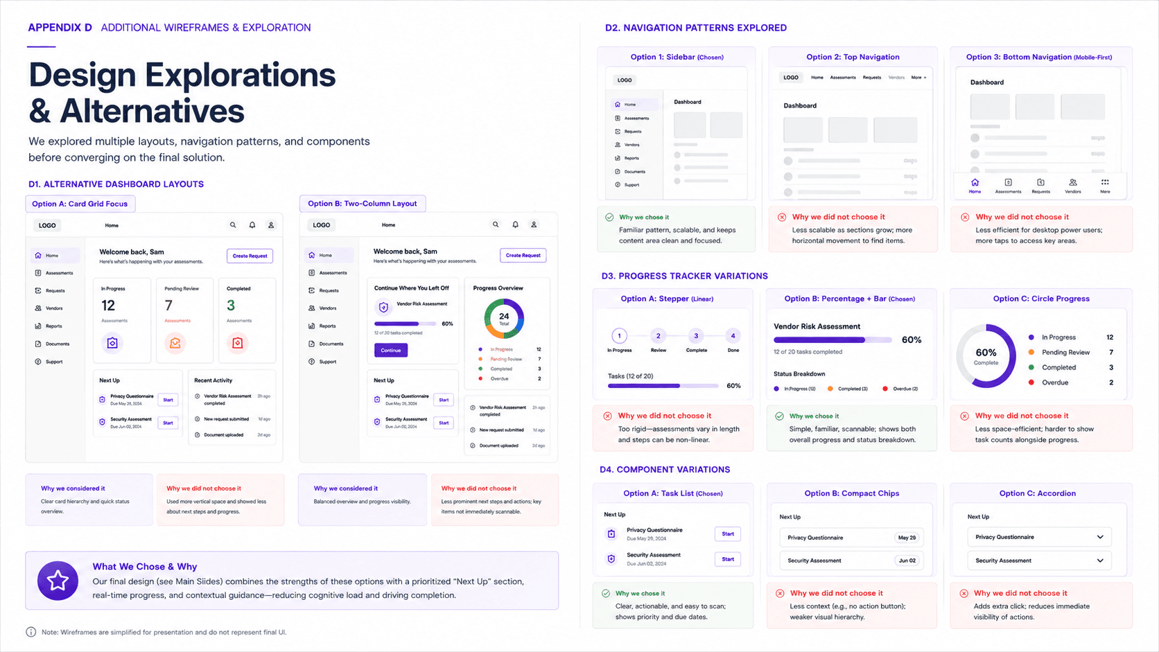
Low-fidelity exploration focused on testing multiple approaches for:
assessment visualization
process tracking
dashboard layouts
support content placement
onboarding structure
Several concepts explored progress indicators, dashboard summaries, and modular solution cards before moving into refined designs.
Outcome
The proposed experience created a more structured onboarding journey while reducing complexity across assessment workflows.
Expected benefits included:
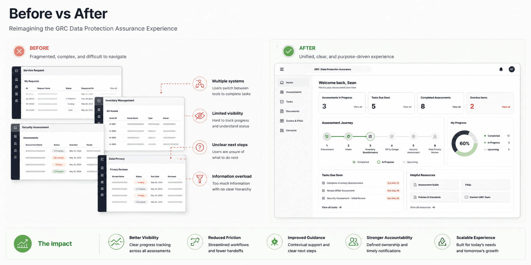
improved task discoverability
clearer user guidance
increased process transparency
reduced navigation friction
stronger scalability for future workflow expansion
Reflection
Enterprise products often fail because they optimize for process rather than user understanding. This project reinforced the importance of balancing business requirements with clarity, guidance, and usability. Small structural changes in information architecture can significantly reduce friction in complex systems.